By Matt Fennell
26th February 2015
Posted in Design, Web Dev, Website Design
All throughout University, and in my career as a web designer, the desktop design has come first. I’ve learned how to design for desktops, creating pixel-perfect Photoshop PSDs which look perfect for clients, but this is changing.
Since 2014 there are now more mobile users than desktop users, with roughly 2 billion of us reaching for our smartphones or tablets when wanting to access the internet. These statistics have caused web designers and front-end developers to re-evaluate the process of creating a website.
The days where all that was required was 1 design, which would be used across all devices and screen sizes are long gone; in today’s world you now need 3-5 as a bare minimum.
To help me adapt I’ve had to alter my approaches, the tools I use, and the processes I take when creating the first design concepts for clients to view. If you’re just starting with mobile first design then hopefully some of my experiences and solutions below will help you.
You need the clients trust
It’s now impossible to show a client how a website will look for every user. If you take a look at the W3 Counter website, you can see users’ screen resolutions vary from 320×568 up to 1920×1080, with everything in-between.
Due to this change your clients now need to trust you, as a designer, to create a design which functions and looks aesthetically pleasing for their customers. Yes, you can show them an example of how it will look on a mobile, tablet and desktop device – but they need to be made aware that these are only examples and you cannot create designs to cater for every possible device.
To help build trust with a client show them your previous responsive work, or have a meeting where you can show them how sites collapse depending on the device and resolution. Having your clients trust has never been as important as it is now!
Sketch
When I first started creating web designs I was never one for sketching. Instead I liked to jump straight onto Photoshop getting my creative ideas down in a digital format. I believed it was quicker and more precise to play around with the design until it looked as I wanted, instead of creating numerous sketches.
I also knew the generic size of my container and could fit elements and blocks into it, without having to worry about how it would collapse for mobile users.
But all of this has changed now thanks to mobile first design. My first proper design is now the one for the mobile user. As this still seems a little alien to me I always also create a desktop sketch at this stage. This gives me the familiarisation and allows me to think more clearly about the mobile design and how it will scale up.
So grab a large pad and a sharp pencil and design how it will look on the desktop, and how you imagine it will collapse down to tablet and mobile layouts. Then once you’re happy, finally load up Photoshop and create those beautiful full concepts – starting with the mobile version.
Responsive Wireframes
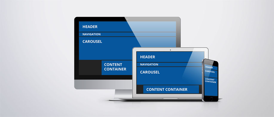
Responsive wireframes allow you as a designer to see how the various different blocks will float on different sized screens. Don’t be too worried about making it perfect, or adding too much detail; just ensure you have the main areas: header, footer, navigation, and the content.
There are many tools which can help you quickly create responsive wireframes. More information on these is within the section ‘Use a framework’ below.
One advantage of creating wireframes is that when you come to template a lot of the initial work is already complete. You already have the core elements coded in responsive HTML, and only need to add the details and any styling.
Another great way of reducing your time spent templating is by creating a style tile. Style tiles contain all the different re-used sections of the website so you can copy and paste code wherever you use them. Your style tile can be as big or as small as you want but I recommend you spend the time adding the following:
- Icons
- Typography (H1-H6)
- Buttons
- Form Elements
- Colour Palette
Use a framework
Frameworks like Bootstrap and Foundation have made developing for multiple devices so much easier. No longer are you required to work out the best break points and create your own media-queries.
If you’re going to use a framework during development (and you should!) then read below about how they can help you within the design process:
Firstly, you can download Photoshop PSD files for free. These highlight the column structures and the correct width for the containers for mobile, tablet and desktop layouts.
To speed up the wireframing process, and ensure your wireframes are using your framework you can use a tool such as Pinegrow, Pingendo or LayoutIt! All three of these let you drag and drop elements, creating the correct code for your framework in the background. When you come to preview, you will have a fully responsive wireframe, and all you will have had to do is drag and drop.
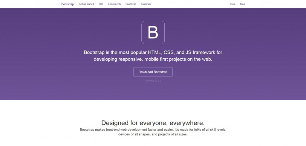
I cannot recommend using a framework enough. My personal favourite is Bootstrap, created by Twitter. Bootstrap contains glyphicons, a robust column structure, helpful CSS, a responsive carousel and modal box and much much more.
Conclusion
As a web designer or developer you will never know everything, and will always need to acquire new skills. The emergence of mobile first design is just another example of this. Your skills haven’t really changed, just the way you go about utilising them for the good of both the client and yourself.
At first I was stuck in my ways, and continued designing the desktop PSD first, like I have always done. However, after encountering numerous issues and problems when developing responsive websites from these designs I knew a change was needed; that change is mobile first design.
Click here for more information on our web design services.
If you want to know more about how I’ve adapted my approach when designing responsive website please feel free to tweet me at @matfennell.