By Tim Lees
29th July 2014
Posted in Google Analytics, SEO
![]() Understanding Google Analytics can be quite a daunting prospect if you are not familiar with the service. This series of guides aims to provide a simple introduction to help an owner of a website get the most out of their account. This guide is based on Google’s Universal Analytics rather than the Classic Google Analytics. If you want to know more about the differences and whether you are using one or the other please click here.
Understanding Google Analytics can be quite a daunting prospect if you are not familiar with the service. This series of guides aims to provide a simple introduction to help an owner of a website get the most out of their account. This guide is based on Google’s Universal Analytics rather than the Classic Google Analytics. If you want to know more about the differences and whether you are using one or the other please click here.
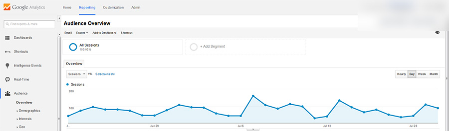
The audience overview page for Google Analytics is essentially your dashboard for website data, giving you a snapshot of core metric data concerning your site. Once you have logged in and selected your account, this will be the initial page that you see. I will go through the defaults that Google show on this page and I will then end the article showing how you can alter this view to suit your needs.
The Overview Tab
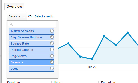
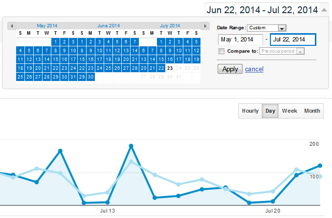
The main graphical data that makes up a good portion of the Audience overview is this overview tab. Analytics allows you to view visitor information about your website split into different metric types over a given time period (more on this later). If you click the selection drop down underneath the ‘Overview’ heading you will see the options to view data by the following:
Users
Users are termed as unique visitors to your website. Each user might revisit your website a number of times over a period of time but that will only be classed as a single user to the website. Each visit to your website that a user has is classed as a ‘Session’.
Sessions
A session is classed as a number of different interactions with your website (from basic page views to purchasing a product) by a user and can last as little as a few seconds or a number of hours. So for example a user could click a number of pages on your website over a period of a few minutes: this would be classed as a session. A session expires once there has been a period of inactivity by the user (30 minutes) or is reset at the beginning of each day (expiry can also take place through variant campaigns but at this point we don’t need to concern ourselves with this). If I browsed your website and left my computer with your website open and returned over 30 minutes later and began browsing your website again this would then be classed as a new session.
Pageviews
An easy one to understand. This counts the different page views on your website. Repeated page views of the same page are still counted uniquely.
Pageviews/Session
This filter view takes the number of sessions against the pageviews and gives you an average of how many pages are viewed per session.
Bounce Rate
With bounce rates bigger is definitely not classed as better. Bounce rate is what is classed as a user directly going to a page on your website and then leaving without interacting further with any elements of your website. The higher the bounce rate percentage the worse this is for your website as it is essentially telling you that your users are not engaging with your website.
Avg Session Duration
Another fairly self explanatory one: this tells you the amount of time, on average, users are interacting with the website per session.
% New Sessions
An estimated percentage of first time sessions to your website.
The Vs Tab
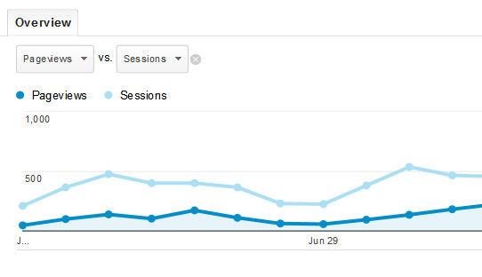
You may, for example, want to compare the amount of new users your website has had and correlate that with bounce rate percentage. Analytics allows you to do this by selecting a vs. metric that then updates your main graph to show these two comparisons.
Viewing your data by time segments
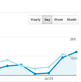
By default Google Analytics serves this content on a per day basis. This view can be altered to Hourly, Week or Month. Viewing by month gives you a nice idea of whether your metrics are increasing or decreasing.
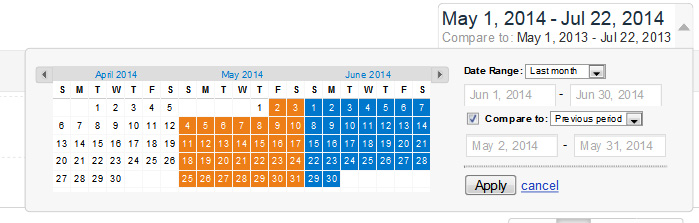
Altering the time frame to view your metrics
A very handy tool is to set the timeframe you want to view these metrics by. You will see a date picker at the top right hand side of the page.
Clicking into this allows you to pick your own start and end date. So if you wanted to see the last 6 months’ worth of data rather than the last month’s then you can set a new start date to allow for this.
A very handy element to this already very handy tool is that you can choose a comparative period so that you can compare how your current metrics are comparing to say this time last year.
Individual Metric Graphs
Underneath your main metric graph you will see a number of other small graph snapshot images detailing each metric.
Visitor Pie Chart
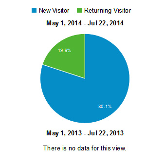
A simple pie chart that allows you to see the percentage of new visitors with returning visitors.
Demographics, System and Mobile
All the data above is great but ideally you need some context regarding where that data is coming from. This is where this segment of the Audience Overview page comes in.
Demographics
Handily Google allows you to see basic information about where your traffic is coming from. Unless you are a true global brand the first two options of ‘Language’ and ‘Country/Territory’ should throw no surprises for you. The ‘City’ option is extremely useful to see where users are specifically coming from. For example, if you are a local business offering a local service based in Stafford and your website is optimised to promote this locality then you would expect and hope to see the majority of your visits to come from ‘Stafford’. If this is not the case then some tweaking is required to your website.
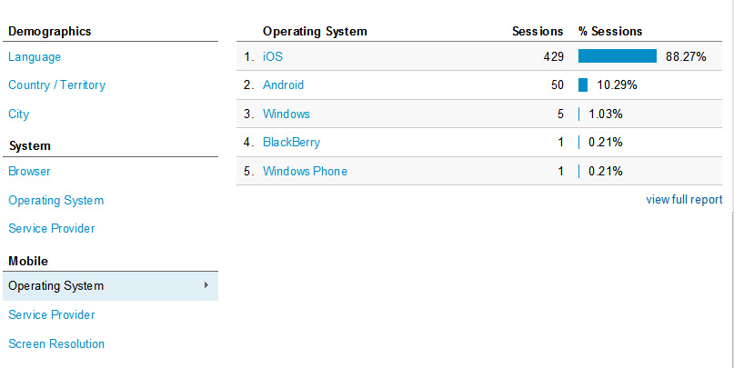
System & Mobile
‘System’ allows you to view how your visitor numbers are split by browser, operating system and service provider.
‘Mobile’ shows you the percentage of visitors by operating system, service provider and screen resolution.
Segments

Segments are a powerful reporting tool that allows you to segment off your metrics. For example if you wanted to know how much of your traffic was coming from a particular geographical area eg ‘Show me all visitors who located in London’ or how much of your traffic has led to a purchase on your website then this tool allows you to do this. Segments is a fairly in depth tool in its own right and will be covered in detail in a future post.
Conclusions
In this first part of understanding Google Analytics basics we have covered the Audience Overview page. You can see that this is a very useful ‘at-a-glance’ overview of your visitor metrics and is designed to give you an immediate report on how well your website is doing.